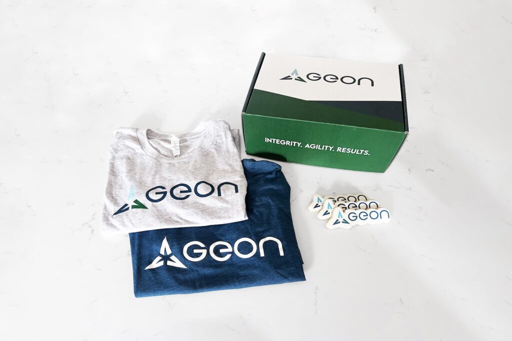
Over the past 12 years, Geon has built a reputation of delivering solutions to the industry’s most difficult technical challenges due to its foundational principles of integrity, excellence, and technical distinctiveness, and the expertise, drive, character, and courage of its team. The refreshed brand communicates these foundational principles as well as the mantra of integrity, agility, and results that makes the Geon team distinct.
Behind the Name
The new logo features a custom logomark and logotype. The mark consists of three triangles, representing the company’s mantra: integrity, agility, and results. The triangles come together to form an abstract outline of a geon in the negative space, the inspirational concept for the company’s name.
A geon is a parametric model for a set of approximately 40 simple 3-dimensional volumes that scientists believe form the basis of visual perception. More simply, a geon is a fundamental shape that, when combined with other geons, forms the basis of all complex structures.
In the same way that geons come together to form complex shapes, the triangles come together to form an upwards arrow, reflecting the unlimited potential of the Geon team. Geon is comprised of forward-thinkers and doers who continually strive for progress, innovation, and excellence.
Commitment to Integrity, Agility, and Results
The brand colors build on the logo’s meaning and further signify Geon’s commitment to integrity, agility, and results. Blue, which is universally associated with trust, loyalty, and strength, remains a primary color. The color palette has been updated to include a darker blue shade and modernized with the use of a second light blue tone. The color palette also incorporates a forest green, representing the continual growth and progress Geon and its employees can achieve.
History of Excellence
In alignment with the foundational principles and mantra, Geon’s mission is to demonstrate excellence in all areas of business and technology to its employees, partners, and customers with the greatest dignity. The original logotype that has become synonymous with the Geon brand has been incorporated in a bolder way, balancing the logomark and serving as a visual reminder of Geon’s core values and continued commitment to excellence.